Monday, December 12, 2016
My Morning Jacket
I have a new appreciation for screenprinting after two workshops where I basically made ALL of the rookie mistakes. That said, I love this print by John Solimine for a My Morning Jacket show at Williamsburg Park in Brooklyn. It's wonderfully illustrated and the composition is great. I also love the fact that it's a three color print, and the layering of the colors gives more color combination options. I really want to try something like that in the future.
No Butts About It (that was terrible, I'm so sorry...)
I really enjoy this very simple and humorous ad for for an artist representative agency. I wasn't able to find an artist name for this particular ad, but I applaud them for their humor and style. In my mind, this is the perfect amount of illustration to ad to this picture. Any less, and you lose the image of the cat, and any more and you lose the connection to the construction worker. Very well done, whoever you are.
Illustrative Typography
I found this great example of illustrative typography in the November 2009 issue of Computer Arts. This piece by Lee Bamforth was chosen as the winner of the 2009 Digital Artist of the Year in the category of Graphic Design, and it's not difficult to see why. I enjoy how the lines lead your eyes along a dancing path and through the twists and scrollwork. It's very reminiscent of decorative architectural metalwork, which fits the subject matter.
Wednesday, November 9, 2016
Bob Masse: The Rock and Roll Artist
I recently had an opportunity to take a very brief vacation to St. Louis, and while I was there, I visited the Blueberry Hill diner. It's a landmark restaurant in St. Louis and features a large collection of pop culture memorabilia. Among the many gig posters, comic book covers, and Rolling Stone covers that adorned the walls, I saw these Bob Masse poster prints which are just amazing examples of his work. I'm a huge fan of modernized art nouveau work, and his posters are just wonderful pieces of art and design.
Friday, October 21, 2016
An Actually Good Movie Poster
It's always nice to see Hollywood doing something slightly different and original, even if it's just green-lighting a visually interesting movie poster for general use. For most movies, the posters fall into one of several predictable formats (case in point) that just feel a little boring to me after a while. Every once in a while, though, a movie will actually use a poster that showcases amazing design work. This is one of those posters. This poster was designed by LA, which is described on their website as "a creative agency made up of 80 award-winning artists, illustrators, editors, photographers, matte painters, motion graphics designers, copywriters, VR gurus, producers, and account executives." They are based in Los Angeles, CA and New York, NY.
Wednesday, October 12, 2016
Minimal Minimalism
Taking minimalism to an extreme is always an interesting exercise, and this single line study by DFT, a french creative duo, is no exception. I really love how these animal designs were boiled down to the most basic of recognizable features. If you are interested, DFT has a few more single line exercises that are pretty cool to see.
Wednesday, October 5, 2016
Text-based Illustration
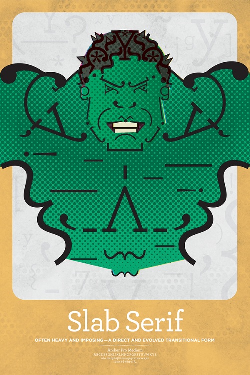
I don't know if this fully counts as illustration or not, but I really love the idea of using text elements to create an image like Matt Olin has done with these images. I really enjoy looking at them, and I admit that some of them work a little better than others. I feel like the posters for Sans Serif, Script, and Handwriting seem to translate the best.
Subscribe to:
Posts (Atom)